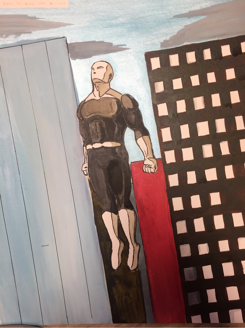
Comic Page 3
This is the page in which the Paragon leaps into action to go find the mall fire. For this page, I decided to color it as it just seemed like the perfect moment to make it pop. This is a big moment, and this big moment took up the entire page. The reason I made this one moment take an entire page was because its the moment where the adventure begins. The Paragon is going into action, and the emphasis on this moment makes it clear that this is where the excitement begins. There is no boredom from here, only action. If I were to change anything, I would use markers to color the page instead of ink. The ink was rather sparkly, and I felt it detracted from the page. Additionally, I would make the buildings have more natural colors. In the end, this is a fantastic way to establish the adventure beginning.
Comic Page 4
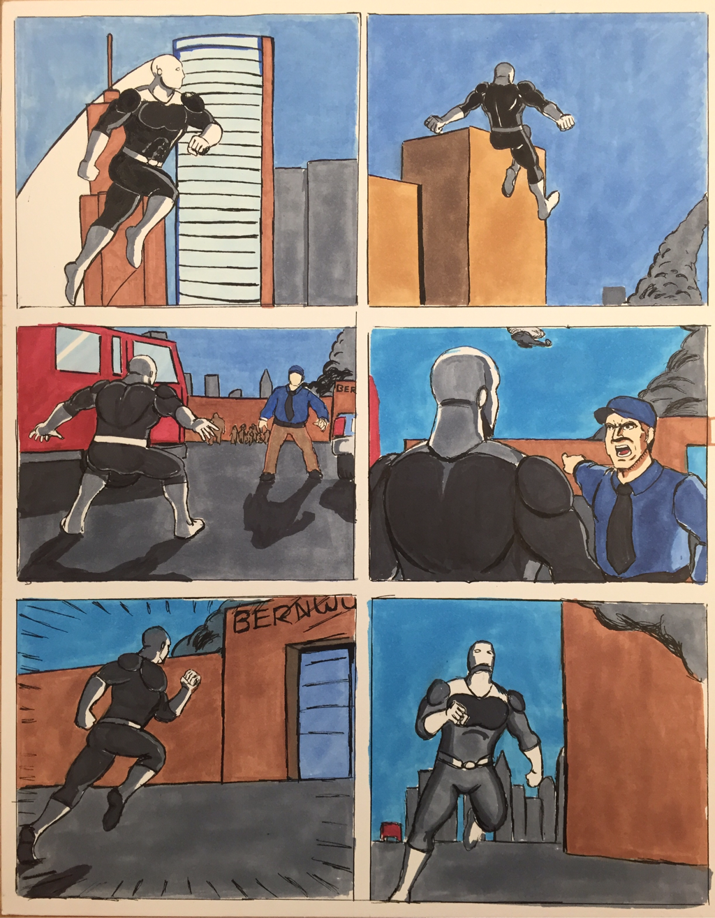
This is the page where the Paragon lands in front of the fire, and runs in to save anyone still inside. An emphasis on shadow helps convey the drama and suspense of the moment. To show the speed at which the Paragon moves, I drew lines along the edge of the second to last panel, giving a bit of a wind effect as he speeds by. I think that movement was conveyed pretty well, but if I were to do it again, I would add more lines to show movement and emphasize action. Overall, I believe this page portrays the action of the scene very well.
Comic Page 5
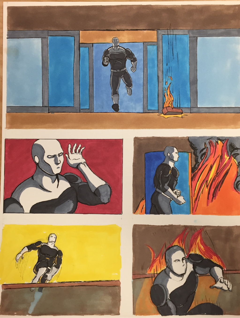
This is the page where the Paragon runs into the burning building looking for anyone still inside. If there was something to push in this page it would be the action and abilities of the Paragon. Yellow and red are my go-to colors for this because they are warm and contrast greatly against the subject. They can evoke a feeling of movement and intensity of the moment. This works well for when action occurs as well as critical moments of the story. It all comes together very well. If I were to do this again, I would make a more uniform background to perhaps make an overall more dramatic scene.
Comics Page 6
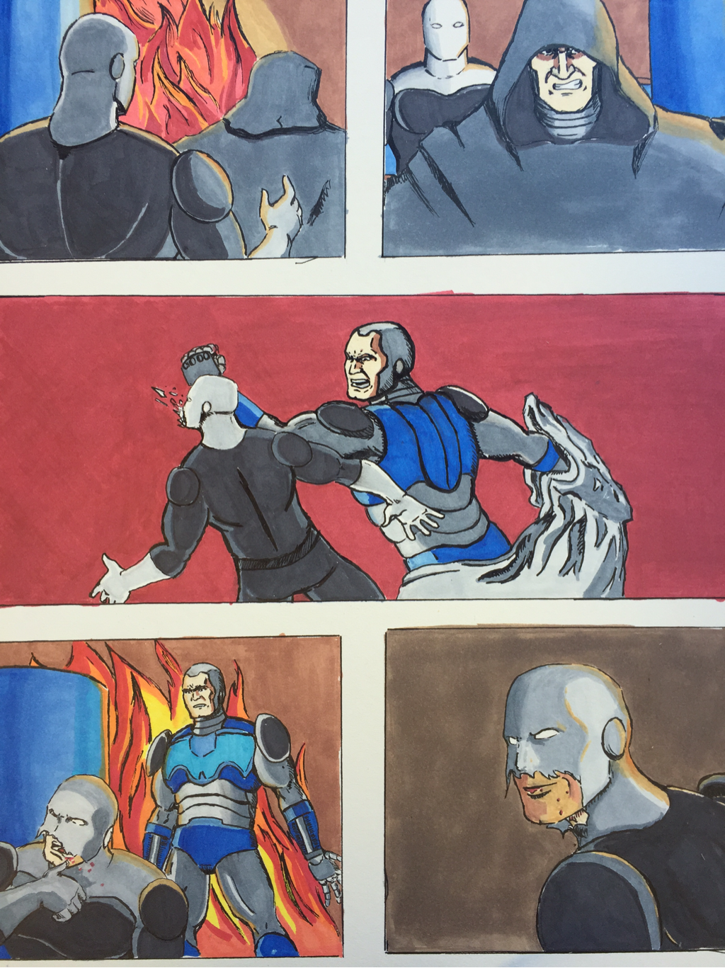
This scene after the Paragon finds a person in a cloak crying. The person is revealed to be the villain who set the building on fire. He sucker punches the Paragon, and tells him to leave. Paragon wipes the blood off his lip, and takes the villain's challenge. The key to the drama here is the lighting and color. Red is used to show how hard the punch is, while fire is used to help heighten the tension of the confrontation. I think that the lighting was done very well, though I feel that marker should be get a second layer to make the color more solid. In the end, I believe that this piece does a good job of conveying the drama and tension of the beginning of the fight.
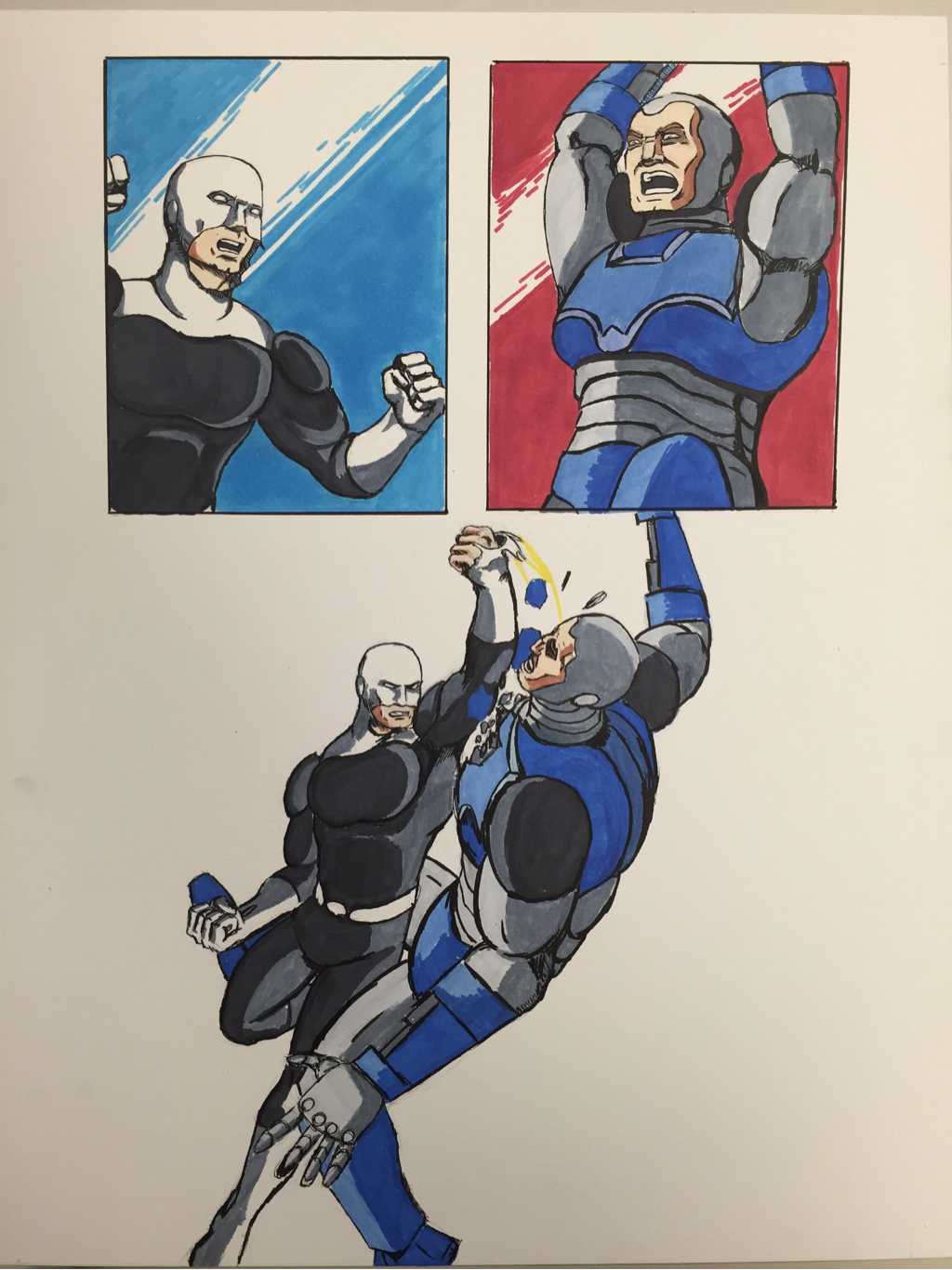
Comic Page 7
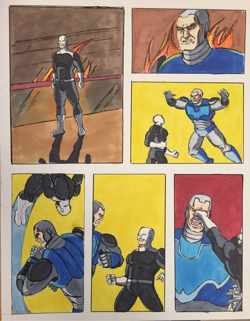
This scene is where the Paragon fights back against the villain, who is too slow to dodge a rather hard punch to the face. The lighting once again helps emphasize the drama of the moment, with the fire burning in the background as a fight is about to occur. Color plays an important role in this piece, with yellow indicating action occurring, blue denoting motion, and red indicating a critical moment. The action was done well in this piece, though I would definitely spend more time on the lighting of the first and second panels.
Comic Page 8
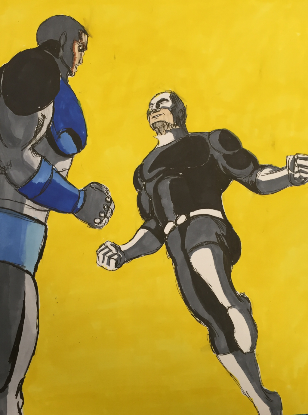
This piece is basically an extension of page 7. The yellow background is used to denote action, though rather than having multiple panels with action, this one has only one large image. It highlights a rather dramatic moment as the Paragon leaps up to continue to fight the villain. I feel that the angle of the perspective is helpful in highlighting the movement and helps the composition. I feel that this piece was successful in continuing the story. If I were to change something about it, I would work on the lines of the character a bit more, as they could be done better.
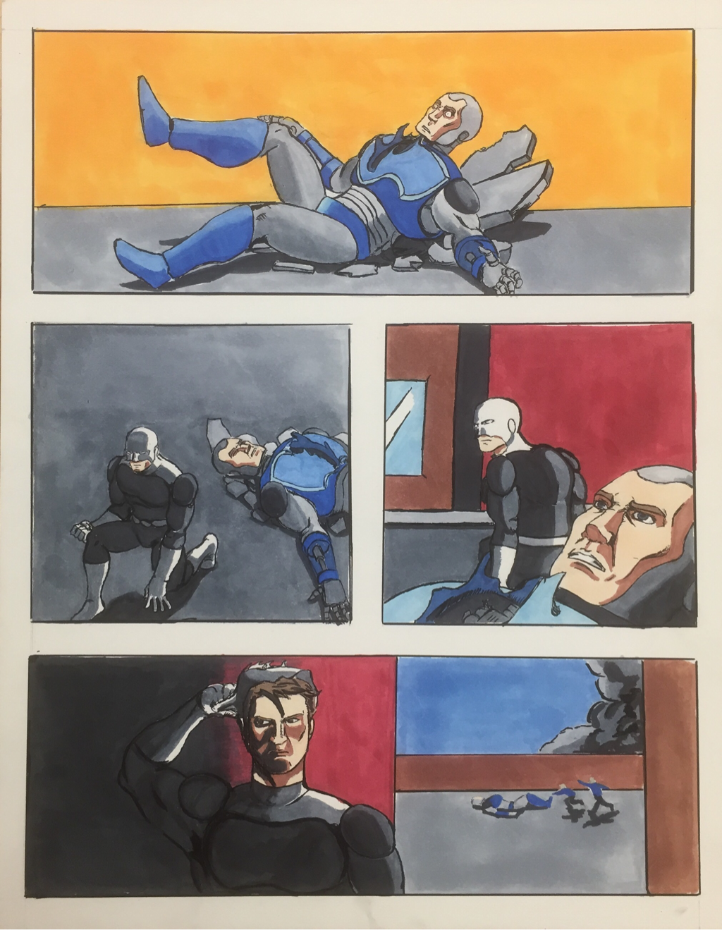
Comic Page 9
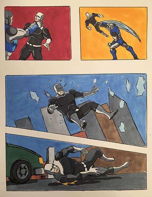
In this page, the villain catches the Paragon and throws him out the window. The Paragon crashes through the glass and has a rough landing in the parking lot outside. Once again, red and yellow are used as the background colors for the action scenes. However, this piece stands out for its bottom two panels. The buildings in the background of the first one and the shape of the panel on the bottom all help illustrate the Paragon falling out of the window. These two panels along with the perspective of their respective scenes only enhance the fall.
Comic Page 10
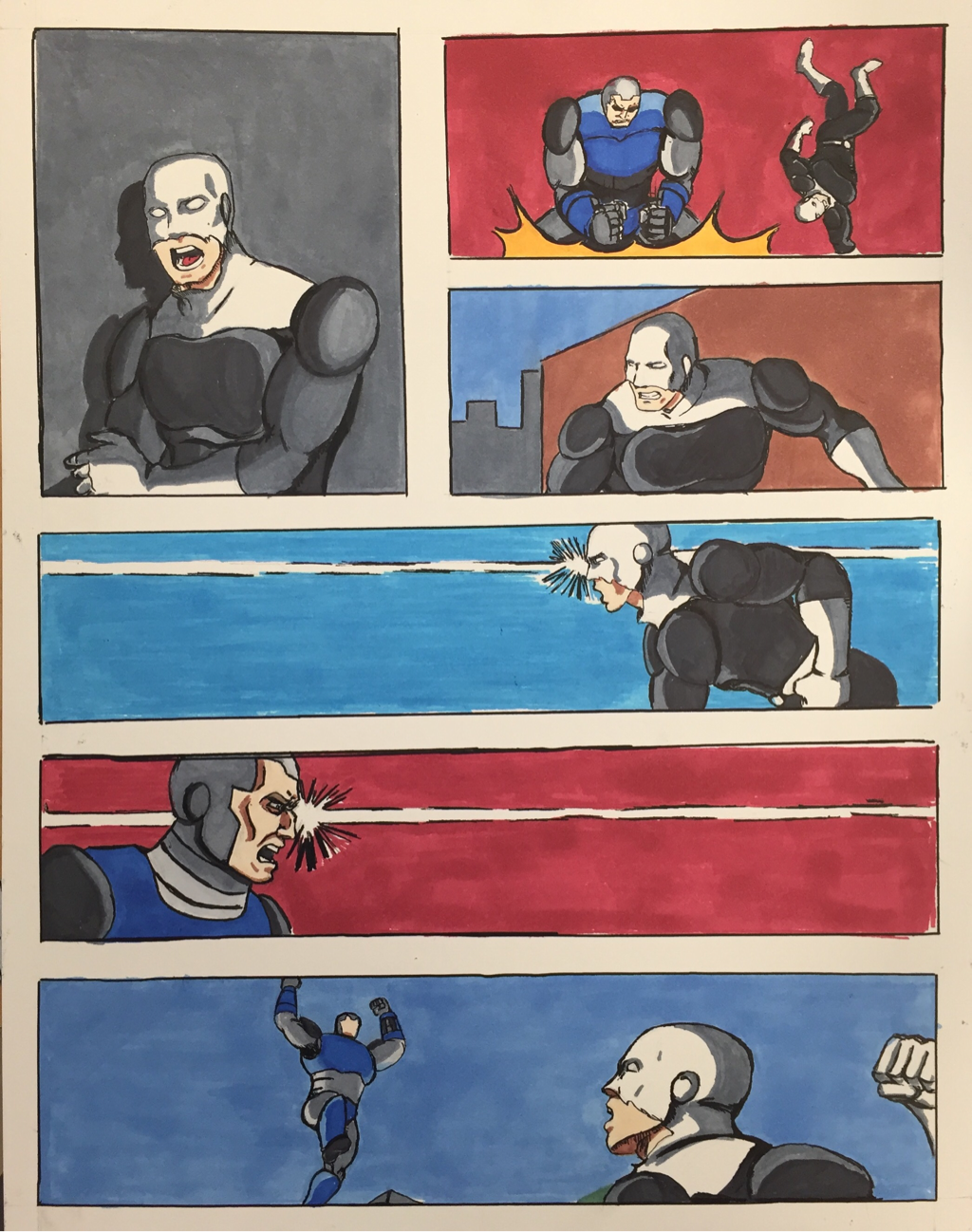
In this page, the villain tries to crush the Paragon, who barely dodges it. They then have a rather intense stare down, then lunge at each other. For the stare down, I decided to do something often used in manga, which is bright lines against a dark or colored background. It helped convey the intensity of the moment. The perspective of the bottom panel is definitely one of the strongest moments out of the whole comic with the background and posing of both the hero and the villain. This whole page is one of the strongest ones out of all my concentration.
Comic Page 11
This is the page where the Paragon defeats the villain with a hard punch to the chest. This is one of my favorite pieces due to the composition and colors. The blue and red shows the motion, and the white in the background helps really emphasize the moment of the punch. There is nothing else but that moment. This is definitely one of the best ones out of the whole concentration.
Comic Page 12
This is the final page of my concentration, with the villain falling defeated, and the Paragon walking away victorious. The second panel is my favorite as the perspective is interesting along with the lighting. Additionally, the lighting of the final fanel is interesting. Overall, this is a strong ending to my concentration, but I feel that the lighting and shading of the final panel could be more interesting.
Breadth Presentation
Concentration Presentation
Reflection
This class has definitely done a lot for me as well as my art. I've learned more mediums and techniques in the first semester than any previous art classes. I've also developed my style, which was something that I didn't think I would have. I think this class was very beneficial towards my growth as an artist.
I've found that AP Art is a class that is almost necessary for someone who wants to be an artist in the future. The only thing that I disliked was the lack of time there was to explore mediums and find the medium best suited for me. I've enjoyed continuing to grow as an artist and watch others improve around me. This class was easily one of the best Art classes that I have taken.
I've found that AP Art is a class that is almost necessary for someone who wants to be an artist in the future. The only thing that I disliked was the lack of time there was to explore mediums and find the medium best suited for me. I've enjoyed continuing to grow as an artist and watch others improve around me. This class was easily one of the best Art classes that I have taken.
