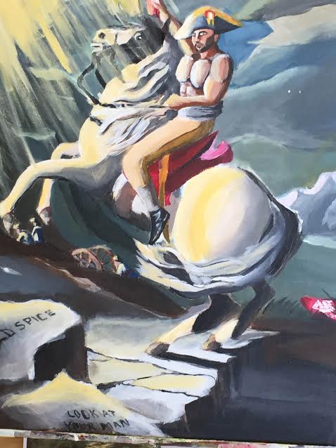
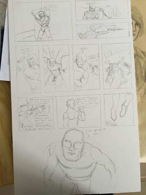
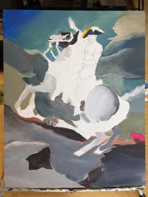
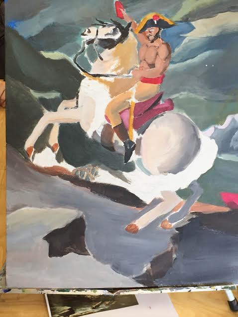
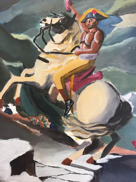
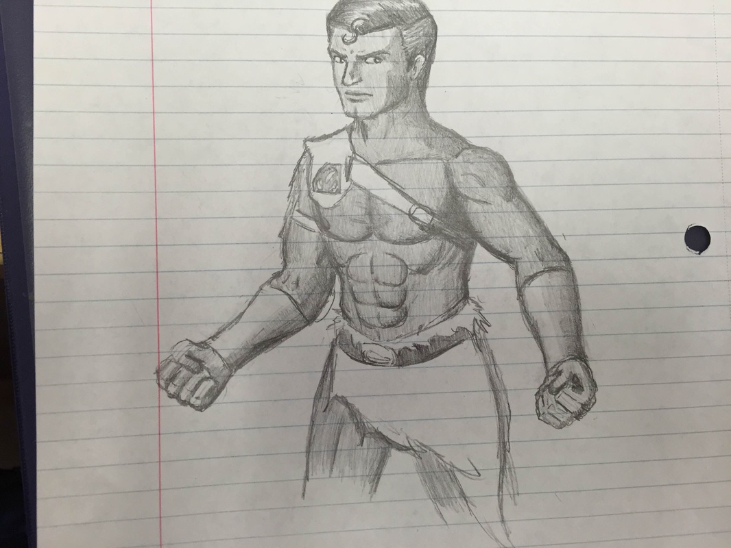
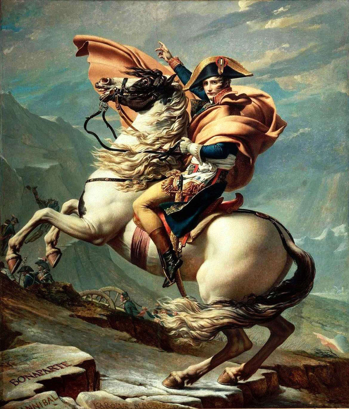
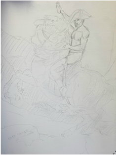
I wish that I'd have spent more time on the Artists Steal project. I really liked the result of the Old Spice Crossing the Alps painting , as it had a humorous and serious effect. There are so many paintings that I could have parodied, that I felt I could have done one more. Additionally, a different medium could be used, such as pen or prismacolor. With all the options of art to parody, I feel sorry that I didn't try and make fun of another art.
To get inspiration, I looked at Action Comics to get an idea of how the story flows and how character expression is utilized. Using the comic for reference, I took some ideas from it and put my own spin on it with original characters. This combination of ideas from a legitimate comic combined with my own ideas worked pretty well in the end. I definitely learned how to use pen better for this project. Pen is a great way to create dramatic lighting, and forced me to think about which parts should be dark and light to create the best effect. I feel that I have gotten better with pen and would like to continue using it in the future. It's hard to say what exactly the meaning of this painting is. The painting parodies "Napoleon Crossing the Alps" by replacing Napoleon with the Old Spice guy. By inserting the Old Spice guy in the painting with a heavenly light shining on him, it mockingly glorifies super-manliness.
The original "Napoleon Crossing the Alps" painting was a propaganda piece intended to get the French to rally behind Napoleon Bonaparte. To do this, David placed Napoleon's name along with other great historical leaders. The gesture of Napoleon's hand as well as his posture suggests a glorious cause with a great leader. The Old Spice advertisements do something similar, but with manliness rather than conquest. I wondered what it would be like if a deodorant brand were to try the conquer the world. How would they get people to rally with them? That is how I got my inspiration for this painting. One thing I've always wanted to do was draw comics. The action and the way it was used to tell a story. Comics are a medium with which you tell a story, so the images must flow right. A good comic has a good story, which was something I couldn't do on just one page. To make up for this, I had only part of a story on the page to create suspense. To get myself ready for this, I first practiced by doing the anatomy, then I did a practice comic involving knights. Afterwards, I did a rough draft of my final comic. The final comic was done with pen. Of course, I wanted to do more afterwards, but I didn't have time. The rough draft involves Superman. This was definitely one of my favorite projects, and I really liked drawing out a story and conveying the mood with body gestures and expressions. This will definitely be something I will continue in the future.
The idea behind artists steal was to either use another artwork and modify it or make a parody of it. If you want, you can add a different meaning to it, but it is what it is: the Old Spice guy riding a horse in the Alps. This painting was done in layers due to its complex lighting and background. First the background mountains were done, then the sky. After the sky was completed, the ground around the horse was painting. The soldiers were added later so that it would be easier to paint them. After everything had a basic layer, the little details such as lighting was added. This mainly applies to the foreground, as the Old Spice guy and his body wash should be the center of attention. In the end, the painting was very satisfying, and I think it does a good job of parodying "Napoleon Crossing the Alps."
After doing one large painting, I decided to try to do more smaller paintings. They were easier to do, and allowed me to practice painting people and animals. Painting is an easy to learn, yet hard to master medium. While I feel that I have improved somewhat, there is definitely room for improvement in acrylic painting. I definitely feel that I will return to this medium in the future.
(FYI Cat painting is unfinished) I had almost no idea as to what I was going to do for the text art unit, until I saw word paths. After some practice, I decided to try out a portrait of someone. I decided to do Walt Disney, because there are so many ways you could describe him (and his movies.) I did this portrait by placing the actual picture underneath all the other layers, and made paths for the text around his face and features. Sometimes, the text would overlap itself, though, so it would either have to get its own text path or be spaced out in a way that would look awkward if it were on a flat line. Overall, I think that this project was a good way to introduce myself to a new medium, and could lead the way to more complex pieces like this in the future.
Digging Deeper ChallengesFinal Project (In Progress) I really liked the path text in Photoshop, it makes for some interesting results, and isn't too complicated. The Batman picture was done using this method, and I think it turned out well. I decided to do a more complex, word portrait of Walt Disney. His portrait will include shading with different shades of words, and he will be composed of quotes from his life and his movies. I feel that this will bring some interesting results.
|
This blog has art on it. There's really nothing else. Archives |