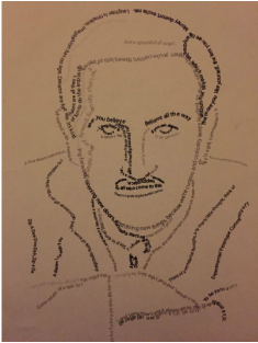
I had almost no idea as to what I was going to do for the text art unit, until I saw word paths. After some practice, I decided to try out a portrait of someone. I decided to do Walt Disney, because there are so many ways you could describe him (and his movies.) I did this portrait by placing the actual picture underneath all the other layers, and made paths for the text around his face and features. Sometimes, the text would overlap itself, though, so it would either have to get its own text path or be spaced out in a way that would look awkward if it were on a flat line. Overall, I think that this project was a good way to introduce myself to a new medium, and could lead the way to more complex pieces like this in the future.
 RSS Feed
